Drawing Primarily: Creighton Michael
a brief and annotated history of my relationship with drawing
Part Two
Return to painting and Nature’s influence
Navigator 290, 1990. The Prudential Insurance Company of America, New Jersey.
Navigator 890, 1990. Plywood, linen, acrylic, lead, graphite, and shellac, 49 x 60 x 12.5”.
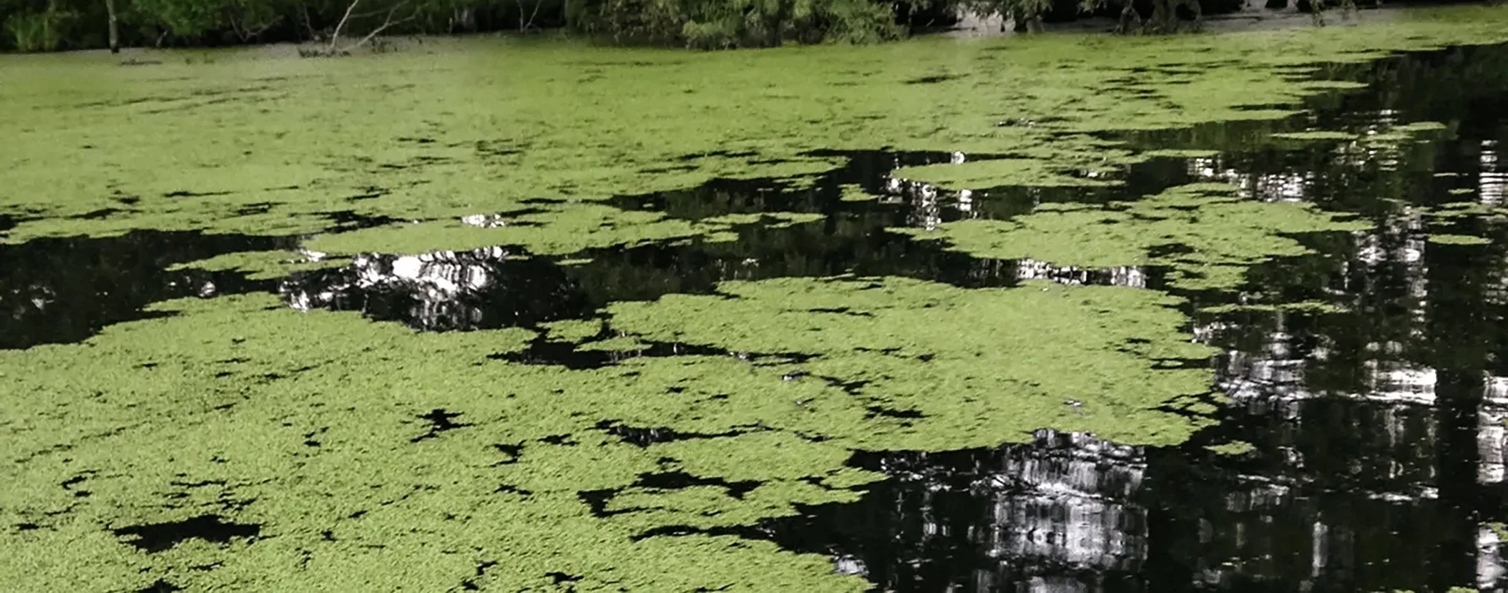
Akin to the Harcourt series of constructed drawings, Navigator explored strategies in developing three-dimensional painting as a product of assembled components that combined both actual and implied space. Like the four-part drawing of the same title, Navigator’s visual elements were inspired by the activities of a local pond.
Navigator, 1990. Graphite on Bristol, 4 panels, 14 x 11” each.
Moving to the Hudson Valley from New York City in 1990 had profound effects on my work. I returned to painting after a fourteen-year hiatus but continued to make my sculpture as well as works on paper. Each of the disciplines would continue be informed by the dazzling array of natural patterns and structures, the mechanics of drawing, as well as the discoveries learned from various explorations.
Nocturne, 1992. Newspaper collage, oil, and acrylic on linen, 5 panels, 60 x 36” each.
The glimmer of moonlight filtering through a forest canopy was the inspiration for my first painting, Nocturne.
The graphite drawings from the Edge series explored imaginary activities occurring between the land and water.
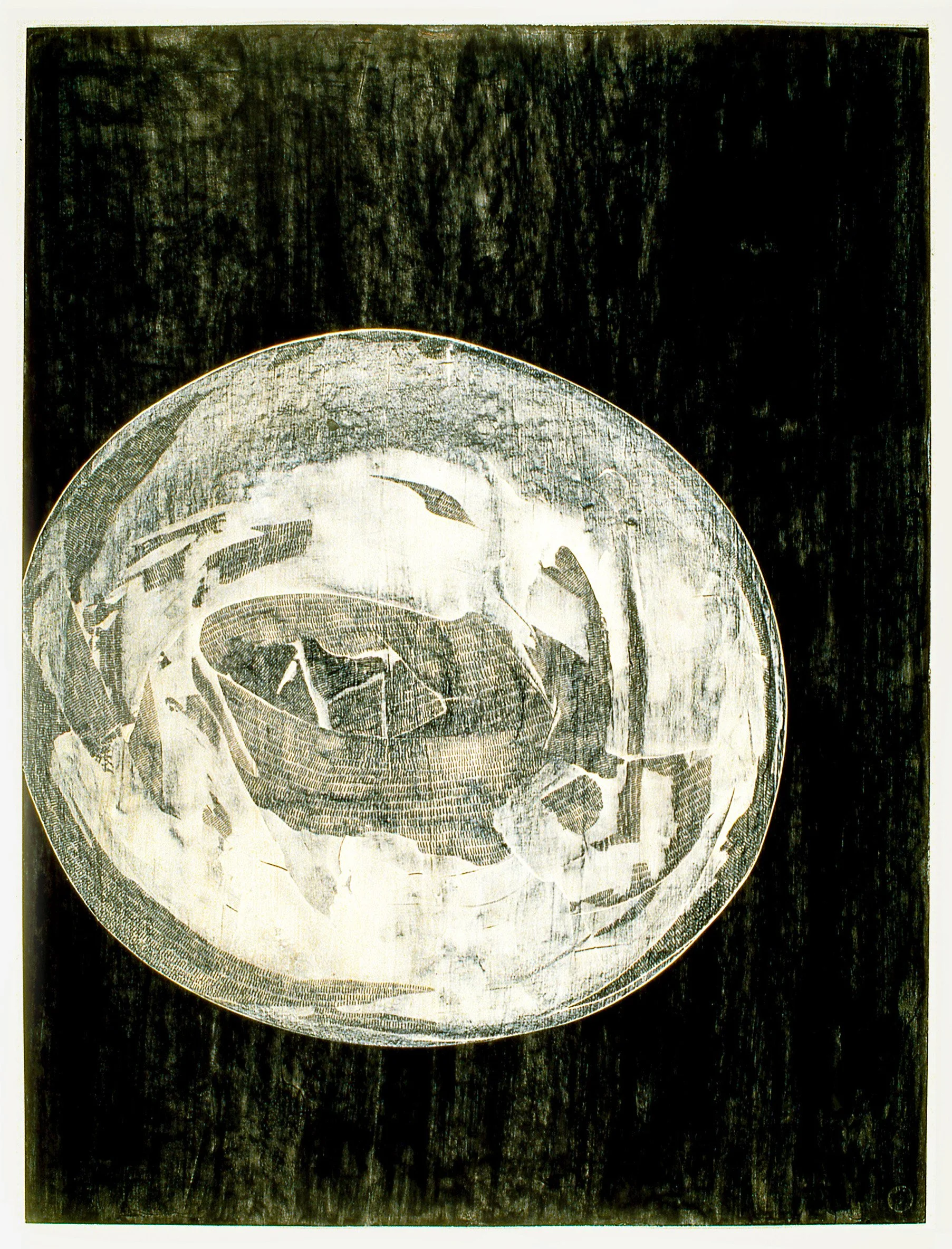
Edge 293, 1993. Graphite on Bristol, 29 x 23”.
Edge 593, 1993. Graphite on Bristol, 30 x 22”. The Belger Family Collection, Kansas City, Missouri.
While my drawings discovered fictional narratives in nature, my paintings attempted to translate visual experiences into pattern often only using lines and circles as primordial symbols.
Edge 293, 1993. Oil on linen, 40 x 30”.
Edge 793, 1993. Oil on linen, 48 x 28”.
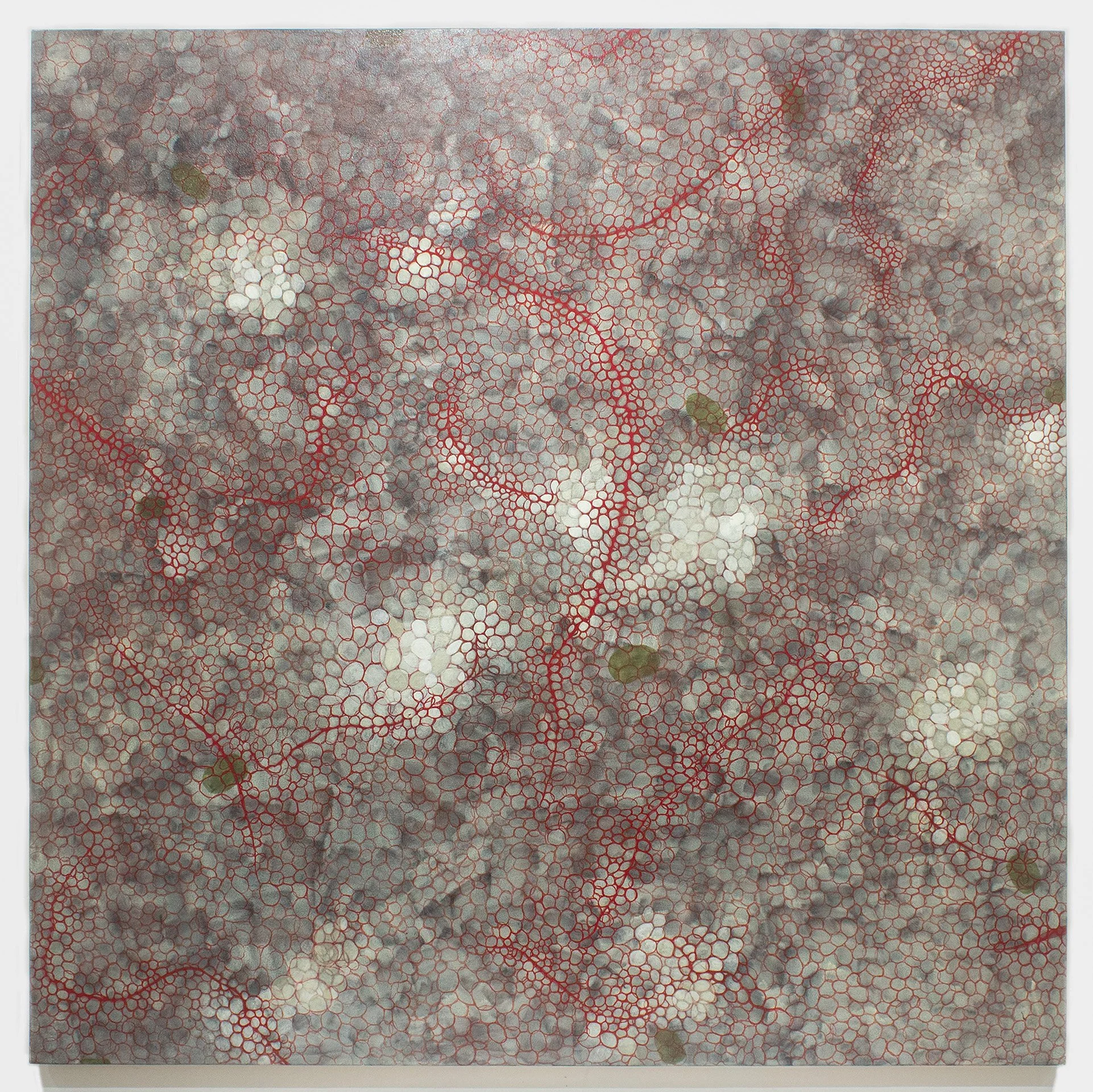
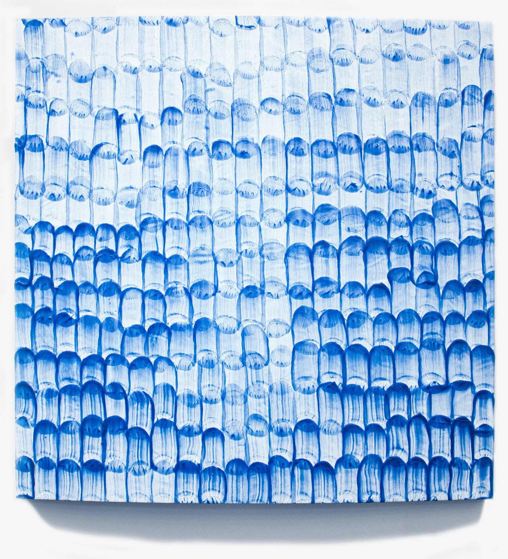
Intrigued by the cellular patterns in duckweed, I saw a relationship to the ink drawings of Yves Tanguy, which had been an early influence in my practice. However, duckweed’s formations are constantly shifting, continually altering its design. Though its appearance changes, it always remains duckweed. This revelation regarding a multiform entity not only created a new direction in my painting but also lead to the development of an innovative category of hybrid sculpture, dimensional drawing.
Stir 195, 1995. Oil on canvas, 30 x 60”.
Dust 195, 1995. Oil on canvas, 30 x 60”. The John and Maxine Belger Family Foundation, Kansas City, Missouri.
The incremental marking patterns that originated in Stir are further developed the Dust series of paintings.
Landscape 1297, 1997. Graphite, gesso, and shellac on Bristol, 35 x 42”. RISD Museum.
B/W 697, 1997. Graphite, shellac, and gesso on Bristol, 40 x 30”.
While experimenting with gesso, I accidentally discovered that it was the perfect material to use as erasure for my works on paper having the added benefit of creating a fresh ground for additional marking.

Quad 897, 1997. Graphite, shellac, and gesso on Bristol board, 4 panels, 49 x 39” installed. National Gallery of Art, Washington, D.C. Gift of Werner H. and Sarah-Ann Kramarsky.
With gesso, I could create near transparent layers that allowed both the drawing’s development as well as a vehicle for documenting its history. The concept of a four panel drawing series, Quad, was inspired by Richard Foreman's use of sensory overload in plays like Penguin Touquet, which I saw at the Public Theater in 1981.
Pull 697, 1997. Graphite, shellac, and gesso on paper, 17 x 14”.
Split 599, 1999. Graphite and shellac on paper, 29 x 23”. Private collection, New York City.
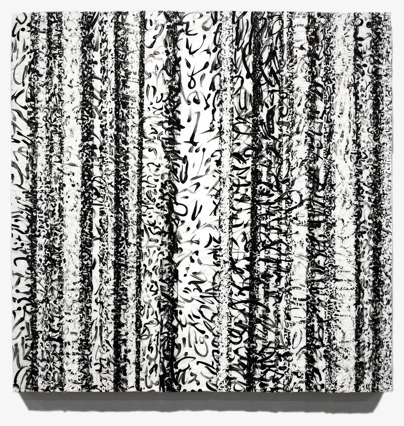
Working with gesso, graphite, and shellac, I explored multiple facets of drawing, including “the marking episode”.
Borrowing the concept of synchronous viewing evident in the late ink drawings of Vincent van Gogh, I created a series of reed pen and ink drawings, titled Rhapsody (1998-2001). This was to better understand the dual nature of van Gogh’s mark, which exists simultaneously a document of past action as well as a unit of pattern. Unlike van Gogh’s pictorial renderings, the resulting imagery in my Rhapsody drawings was process driven, emerging from the quilting of multiple marking episodes varying in both duration and intensity.

Vincent van Gogh, View of Arles, 1888. Reed pen and ink and wash over graphite on paper, 17 x 21.5”. RISD Museum, Providence, Rhode Island.
Rhapsody 1498, 1998. Ink on Bristol, 40 x 30”. Private collection, New York.
Rhapsody 1700, 2000. Ink on Bristol, 40 x 30”. University of Richmond Museums, Richmond, Virginia.
Encouraged by the dynamism discovered in the Rhapsody drawings, I began to evolve my marking vocabulary in the Notation paintings, which became something of a guide for the next decade. The four subsequent series, Mesh, Vestige, Innuendo and Pulse employed a developing, synthetic calligraphy with color to increase both spatial illusion and atmosphere. Incorporating mold stain into its marking mix, Haiku combines my hand with that of nature’s, referencing a space more often associated with traditional Asian landscape painting.
Notation 698, 1998. Oil on canvas, 60 x 60”. American Express, New York.
Notation 998, 1998. Oil on canvas, 60 x 60”. The John and Maxine Belger Family Foundation, Kansas City, Missouri.
Mesh 599, 1999. Oil on canvas, 60 x 60”. Private collection, Colorado.
Vestige 299, 1999. Oil on canvas, 60 x 60”. The John and Maxine Belger Family Foundation, Kansas City, Missouri.
Mesh 799, 1999. Oil on canvas, 45 x 45”. Brauer Museum of Art, Valparaiso University, Valparaiso, Indiana.
Innuendo 299, 1999. Oil on canvas, 60 x 60”.
Pulse 401, 2001. Oil on canvas, 60 x 60”.
Haiku 1000, 2000. Mold stain, acrylic, and oil on stitched canvas. The John and Maxine Belger Family Foundation. Appeared in Law & Order, episode “Acid” (November 30, 2005).
Haiku 1300, 2000. Mold stain, acrylic, and oil on stitched canvas.
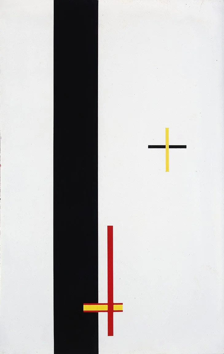
The emotional impact of 9/11 moved my focus from exploring the vibrant patterns of the natural world to an inner space of self-reflection. In the following months, I returned to creating paintings using only lines and circles.
10901, 2001. Oil on canvas, 48 x 48”. KFA Collection, New York City.
121801, 2001. Oil on canvas, 48 x 48”.
My decades long experiences with ocular migraines was the motivation and imagery for the Field series, which began in late 2001. The title, Field, short for “field of vision”was a fusion of painting, sculpture and drawing, structurally inspired by the curved ground of Medieval altar panels. Field with its layers of painted marks generates a spatial tapestry in which the viewer experiences the fragile nature of perception.
Field 1702, 2002. Oil on linen on convex panel, 34 x 32 x 3.5”. Mint Museum, Charlotte, North Carolina.
Field 1802, 2002. Oil on linen on convex panel, 32 x 30 x 3.5”. Akron Art Museum, Akron, Ohio.
Field 2703, 2003. Oil on linen on convex panel, 36 x 34 x 2.5”. The Progressive Corporation, Mayfield Village, Ohio.
Field 3305, 2005. Oil on linen on convex panel, 36 x 34 x 2.5”. Private collection, Copenhagen, Denmark.
Field 5307, 2007. Oil on linen on convex panel, 36 x 34 x 2.5”. Weatherspoon Art Museum, Greensboro, North Carolina.
Field 5508, 2008. Oil on linen on convex panel, 36 x 34 x 2.5”. Arts in Embassies, U.S. State Department, Washington, D.C.
Unlike the Field panels, the Squiggle paintings portray the arcs or auras associated with ocular migraines as a visual disturbance mimicking the effects often experienced during an episode. Both Field and Squiggle use repetitive chromatic patterns to produce atmospheric illusions. With Field, the space has a seemingly volumetric fluidity composed of transparent veneers, which contrasts from the agitated spaces in Squiggle, realized through multiple layers. In the Field panels, disruptions in the visual sphere are depicted as tears in the spatial membrane, not as an additional element as in Squiggle. Their formats differ as well. The Field series are on convex, linen covered panels, while the Squiggle paintings are on flat, stretched canvases.
Squiggle 204, 2004. Oil on canvas, 48 x 48”. Private collection, Copenhagen, Denmark.
Squiggle 804. Oil on canvas, 30 x 30”. Private collection, New York City.
Pushing Squiggle’s vivid background to near opacity, the paintings in Veer trade the black and white rippling bands also associated with Squiggle for a ribbon-like gesture floating across the picture plane. Serving as a visual counter to the vibrant, vertical stream flowing behind it, the laterally suspended form teases the viewer with spatial ambiguity that maintains a fragile balance between figure and ground.
Veer 405, 2005. Oil on canvas, 40 x 40”. Private collection, Copenhagen, Denmark.
Veer 606, 2006. Oil on canvas, 40 x 40”.
Impact is a series of oil paintings executed on concave panels, which explore the dynamism of gestures. Created as a counter to the Field paintings, Impact with its interconnected marking episodes references in two-dimensional terms the drawing activity captured in the wall and floor pieces of the Rhapsody and Trace series.

Trace 312, 2012. Graphite, paper, and acrylic, 38 x 48 x .25”. Private collection, St. Helena, California.
Impact 307, 2007. Oil on concave panel, 36 x 60”. Private collection, San Antonio, Texas.
Rhapsody Wall Horizontal 308, 2008. Paper and graphite-coated rope, 37 x 68 x 7.5”. Private collection, New York City.
Impact 508, 2008. Oil on concave panel, 36 x 60”. Ogden Museum of Southern Art, New Orleans, Louisiana.
Impact 708, 2008. Oil on concave panel, 36 x 60”. Meeschaert, New York City and Paris.
Developed during the summer of 2008, Ply is a series of deferred drawing paintings, inspired by László Moholy-Nagy’s 1922 Telephone Paintings. Paralleling Moholy-Nagy's act of disengagement by establishing distance of both time and space between the artist and the creative act, painted marks, varying in color and intensity were brushed onto separate plastic sheets creating a glossary of translucent strokes. Later these brush strokes were removed and individually placed on a convex panel, building the painting incrementally with transparent layers. The result captures the movement reminiscent of drawing activity with the emergence of pattern.
László Moholy-Nagy, EM2 (Telephone Picture), 1923. Porcelain enamel on steel, 18 ¾ x 11 7/8”. The Museum of Modern Art, New York City.
Ply 708, 2008. Layered acrylic on convex panel, 24 x 24 x 2.5”.

Ply 1009, 2009. Acrylic on convex panel, 24 x 24 x 2.5”. Ewing Gallery of Art & Architecture, University of Tennessee, Knoxville, Tennessee.
Motif is a series of paintings utilizing two different marking styles with contrasting color systems, prismatic and pigmented. Composed of multiple layers of translucent acrylic strokes, the substructure is enveloped in an opaque calligraphic lattice of oil paint. The visual weight differential between the two-color strategies creates optical undulation throughout the picture animating its various networks.
Motif 610, 2010. Oil on acrylic on canvas, 50 x 50”. KFA Collection, New York City, and the HCCC Art Foundation, Jersey City, New Jersey.
Motif 1310, 2010. Oil on acrylic on canvas, 50 x 50”. Delaware Art Museum.
Frequency
By 2011 the impact of digital techniques and processes in my practice were becoming more evident. Frequency is a perfect example of analog and digital integration.
Palimpsest is a document of marking episodes, eliminating commentary with a focus on the visual effects of emerging pattern. Calligraphic marks suspended between transparent acrylic sheets (pages) are layered on the painting’s surface to create an illusion of text hidden within a shifting motif. Palimpsest continues my deferred marking activity, first developed in 2008 with the Ply series. By 2013, the flat canvas plane is replaced by the structure of a concave wood panel to optically suspend the text layer above the surface.
Palimpsest 112, 2012. Layered acrylic on canvas, 30 x 30”.
Palimpsest 413, 2013. Layered acrylic on concave panel, 36 x 36 x 2.5”.

Script 314, 2014. Layered acrylic on concave panel, 36 x 34 x 2.5”. Private collection, New York.
Script 414, 2014. Layered acrylic on canvas, 30 x 30”.
The Script series parallels the exploration and process that began with the Palimpsest series, but without color.
In 2011, the Backchannel series combined concepts and techniques that began while developing the Ply panels with recent digital achievements, which would alter the direction of my painting.